The grouping button is displayed if:
- DisplayGroupingButton property is True
- ShowGroupingEvents property is True
The control displays groups if:
- ShowGroupingEvents property is True
- The Groups collection has elements. By default, the Groups collection contains no Group objects.
The following Background properties change the visual appearance of the drop down grouping panel:
- Background(exGroupingBackColor) / Background(exGroupingForeColor) changes the background and the foreground color of the panel.
- Background(exGroupingSelBackColor) / Background(exGroupingSelForeColor) changes the background and the foreground color of the selection in the panel.
- Background(exCheckBoxState0), Background(exCheckBoxState1), Background(exCheckBoxState2) changes the visual appearance for the control's check boxes.
- Background(exRadioButtonState0), Background(exRadioButtonState1), changes the visual appearance for the control's radio buttons.
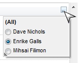
The following screen shot shows the drop down panel, if the SingleGroupingView property is False ( by default ):
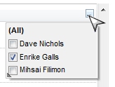
The following screen shot shows the drop down panel, if the SingleGroupingView property is True: