The control displays groups if:
- ShowGroupingEvents property is True
- The Groups collection has elements. By default, the Groups collection contains no Group objects.
The following Background properties change the visual appearance of the drop down grouping panel:
- Background(exGroupingBackColor) / Background(exGroupingForeColor) changes the background and the foreground color of the panel.
- Background(exGroupingSelBackColor) / Background(exGroupingSelForeColor) changes the background and the foreground color of the selection in the panel.
- Background(exCheckBoxState0), Background(exCheckBoxState1), Background(exCheckBoxState2) changes the visual appearance for the control's check boxes.
- Background(exRadioButtonState0), Background(exRadioButtonState1), changes the visual appearance for the control's radio buttons.
The Description(exGroupBarAll) property changes the "(All)" predefined string, being displayed on the top of the drop down grouping/filtering panel.
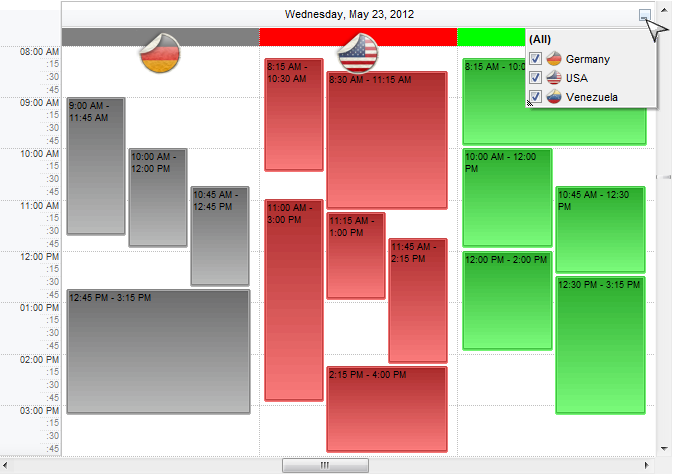
The following screen shot shows the events with grouping colors applied, including the grouping panel:
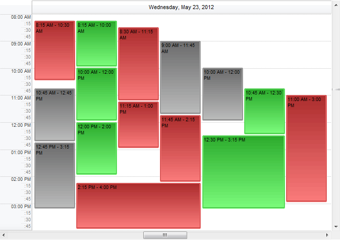
The following screen shot shows the events with grouping colors applied, but with no grouping button/panel:
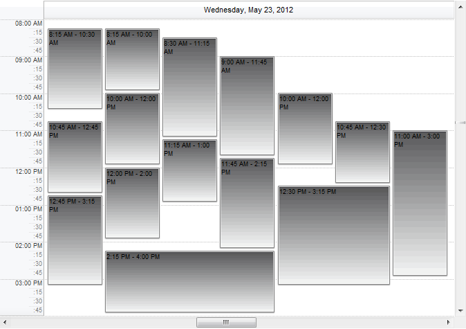
The following screen shot shows the events with no grouping colors apply: