The eXContextMenu supports the following properties and methods:
The eXContextMenu supports the following properties and methods:


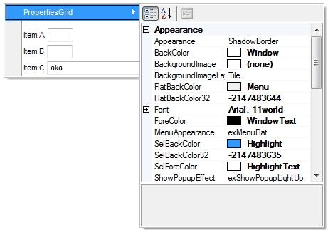
| Name | Description | |||
| AllowToggleRadio | Allows or prevents toggling the radio state. | |||
| AllowToolTip | Allows or prevents showing the item's tooltip. | |||
| Appearance | Retrieves or sets the control's appearance. | |||
| AttachTemplate | Attaches a script to the current object, including the events, from a string, file, a safe array of bytes. | |||
| BackColor | Specifies the control's background color. | |||
| Background | Returns or sets a value that indicates the background color for parts in the control. | |||
| CloseOnClick | Gets or sets a value that specifies whether the context menu is closing. | |||
| Cursor | Gets or sets the cursor that is displayed when the mouse pointer hovers the control. | |||
| Debug | Retrieves or sets a value that indicating whether the item's identifier is visible. | |||
| EventParam | Retrieves or sets a value that indicates the current's event parameter. | |||
| ExecuteTemplate | Executes a template and returns the result. | |||
| FlatBackColor | Specifies the color to left part of the menu. | |||
| FlatImageWidth | Specifies the width of the column to display the icons/images when the control's MenuAppearance is exMenuFlat. | |||
| Font | Retrieves or sets the control's font. | |||
| ForeColor | Specifies the control's foreground color. | |||
| Get | Retrieves an array of Item objects that meet the criteria. | |||
| GetChecked | Retrieves an array of Item objects, that displays a check box which is checked. | |||
| GetRadio | Retrieves an array of Item objects of radio type in the same group, that are checked. | |||
| GetUnchecked | Retrieves an array of Item objects, that displays a check box which is unchecked. | |||
| HTMLPicture | Adds or replaces a picture in HTML captions. | |||
| Images | Sets at runtime the control's image list. The Handle should be a handle to an Images List Control. | |||
| ImageSize | Retrieves or sets the size of icons the control displays. | |||
| IncrementalSearch | Specifies how the control searches for the objects while user types characters. | |||
| item | Returns a specific Item object giving its identifier or caption. | |||
| Items | Retrieves the control's Items collection. | |||
| LocalAppearance | Retrieves or sets the local popup's appearance. | |||
| MenuAppearance | Retrieves or sets a value that indicates the menu's appearance. | |||
| Notifier | Retrieves or sets the handle of the window that receives notifications/WM_COMMAND messages. | |||
| Picture | Retrieves or sets a graphic to be displayed in the control. | |||
| PictureDisplay | Retrieves or sets a value that indicates the way how the graphic is displayed on the control's background | |||
| Refresh | Refreses the control. | |||
| ReplaceIcon | Adds a new icon, replaces an icon or clears the control's image list. | |||
| SelBackColor | Retrieves or sets a value that indicates the selection background color. | |||
| Select | Displays the shortcut menu at the specified location and tracks the selection of items on the menu. | |||
| SelForeColor | Retrieves or sets a value that indicates the selection foreground color. | |||
| ShowCheckedAsSelected | Specifies whether the checked items shows as selected. | |||
| ShowCheckedAsSelectedTransparency | Specifies the transparency ( percent ) to show the checked items when selected. | |||
| ShowPopupArrow | Indicates the type of the arrow to be shown when the item displays the sub-menu. | |||
| ShowPopupEffect | Specifies the effect to show the popup menu when clicking an item, such as scrolling, lighting up, and so on. | |||
| Template | Specifies the control's template. | |||
| TemplateDef | Defines inside variables for the next Template/ExecuteTemplate call. | |||
| TemplatePut | Defines inside variables for the next Template/ExecuteTemplate call. | |||
| ToolTipDelay | Specifies the time in ms that passes before the ToolTip appears. | |||
| ToolTipFont | Retrieves or sets the tooltip's font. | |||
| ToolTipPopDelay | Specifies the period in ms of time the ToolTip remains visible if the mouse pointer is stationary within a control. | |||
| ToolTipWidth | Specifies a value that indicates the width of the tooltip window, in pixels. | |||
| ToString | Loads or saves the Items collection using string representation (shortcut of Items.ToString property). | |||
| UseVisualTheme | Specifies whether the control uses the current visual theme to display certain UI parts. | |||
| Version | Retrieves the control's version. | |||
| Visibility | Specify the popup's visibility in percents: 90% is barely visible, and 10% is nearly opaque. | |||
| VisualAppearance | Retrieves the control's appearance. |