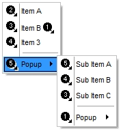
The following screen shot shows the control's frame as displayed by default:
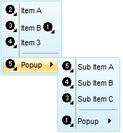
The following screen shot shows the control's frame using a different EBN file:


| Type | Description | |||
| MenuBorderEnum | A MenuBorderEnum expression that specifies the menu's frame appearance, or a color expression whose last 7 bits in the high significant byte of the value indicates the index of the skin in the Appearance collection, being displayed as control's borders. For instance, if the Appearance = 0x1000000, indicates that the first skin object in the Appearance collection defines the control's border. The Client object in the skin, defines the client area of the control. The list/hierarchy, scrollbars are always shown in the control's client area. The skin may contain transparent objects, and so you can define round corners. The normal.ebn file contains such of objects. Use the eXButton's Skin builder to view or change this file |
The following screen shot shows the control's frame as displayed by default:
The following screen shot shows the control's frame using a different EBN file: