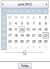
The options that starts with exCalendar refer to a part of the Calendar panel as shown bellow:

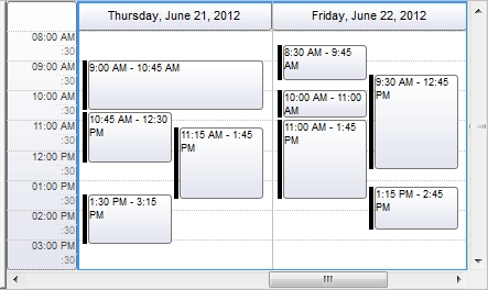
while if the option starts with exSchedule it refers an UI part of the schedule panel as:

The BackgroundPartEnum type supports the following values.
The options that starts with exCalendar refer to a part of the Calendar panel as shown bellow:

while if the option starts with exSchedule it refers an UI part of the schedule panel as:

The BackgroundPartEnum type supports the following values.


| Name | Value | Description | |||
| exCalendarArrowUp | 0 | Specifies the visual appearance for the up arrow in the calendar's header. | |||
| exCalendarArrowDown | 1 | Specifies the visual appearance for the down arrow in the calendar's header. | |||
| exCalendarArrowLeft | 2 | Specifies the visual appearance for the left arrow in the calendar's header. You can use the MinDate property to limit the dates that the calendar can show. When the calendar has no other dates to show, the left or right arrows are not shown. The MaxDate property indicates the upper margin that the calendar can show. | |||
| exCalendarArrowRight | 3 | Specifies the visual appearance for the right arrow in the calendar's header. You can use the MinDate property to limit the dates that the calendar can show. When the calendar has no other dates to show, the left or right arrows are not shown. The MaxDate property indicates the upper margin that the calendar can show. | |||
| exCalendarBackColor | 4 | Specifies the calendar's background color. The Background(exCalendarBackColor) property changes the calendar's panel backcolor if not-zero, else the BackColor property specifies the calendar's background color. | |||
| exCalendarForeColor | 5 | Specifies the calendar's foreground color. The Background(exCalendarForeColor) property changes the calendar's panel foreground color. If this option is not set, the control's ForeColor property indicates the calendar's foreground color. | |||
| exCalendarDaysHeader | 6 | Specifies the visual appearance for the days header. | |||
| exCalendarWeeksHeader | 7 | Specifies the visual appearance for the weeks header. | |||
| exCalendarHeader | 8 | Specifies the visual appearance for the months header in the calendar panel. | |||
| exCalendarTodayUp | 9 | Specifies the visual appearance for the today button in the calendar panel, when it is up. Use the ShowTodayButton property to hide the Today button. | |||
| exCalendarTodayDown | 10 | Specifies the visual appearance for the today button in the calendar panel, when it is down. Use the ShowTodayButton property to hide the Today button. | |||
| exCalendarScrollThumb | 11 | Specifies the visual appearance for the scrolling thumb in the calendar panel. The ShowYearScroll property indicates whether the calendar panel displays an horizontal scroll bar to allow the user to change the calendar's year. | |||
| exCalendarScrollRange | 12 | Specifies the visual appearance for the scrolling range in the calendar panel. The ShowYearScroll property indicates whether the calendar panel displays an horizontal scroll bar to allow the user to change the calendar's year. | |||
| exCalendarSplitBar | 13 | Specifies the visual appearance for the separator bar in the calendar panel. | |||
| exCalendarMarkToday | 14 | Returns or sets a value that indicates the visual appearance for Today date, in the calendar panel. The exScheduleMarkTodayBackColor option changes the visual appearance for Today date, in the schedule panel. | |||
| exCalendarMonthSelect | 15 | Specifies the visual appearance for the selected month in the months drop down window. | |||
| exCalendarMonthSelectForeColor | 16 | Specifies the foreground color for the selected month in the months drop down window. | |||
| exCalendarGridLineColor | 17 | Specifies the color to show the calendar's grid lines. The ShowGridLines property indicates the type of grid lines to be shown in the calendar. | |||
| exSplitBar | 18 | Specifies the visual appearance for control's vertical split bar. | |||
| exCalendarSelBackColor | 19 | Specifies the calendar's background color for selected dates. The AllowSelectDate property specifies the keys combination that user can use to select dates in the calendar panel. The AllowSelectDateRect specifies the keys combination so the user can do a rectangular selection in the calendar panel. | |||
| exCalendarSelForeColor | 20 | Specifies the calendar's foreground color for selected dates. The AllowSelectDate property specifies the keys combination that user can use to select dates in the calendar panel. The AllowSelectDateRect specifies the keys combination so the user can do a rectangular selection in the calendar panel. | |||
| exCalendarHeaderForeColor | 21 | Specifies the foreground color to show the months in the header. | |||
| exCalendarBorderLineColor | 26 | exCalendarBorderLineColor. Specifies the color to show the calendar's border lines. | |||
| exCalendarCommentDate | 27 | exCalendarCommentDate. Specifies the visual appearance to show the dates in the calendar with a tooltip assigned. | |||
| exCalendarDaysHeaderForeColor | 28 | Specifies the foreground color for the days header. | |||
| exCalendarWeeksHeaderForeColor | 29 | Specifies the foreground color for the weeks header. | |||
| exCalendarMarkTodayForeColor | 30 | Specifies the foreground color for the today date, in the calendar panel. The exScheduleMarkTodayForeColor option changes the visual appearance for Today date, in the schedule panel. | |||
| exCalendarTodayForeColor | 31 | Specifies the foreground color for the Today button, in the calendar panel. Use the ShowTodayButton property to hide the Today button. | |||
| exCalendarFocusDate | 32 | Specifies visual appearance for the focused date, in the calendar panel. The AllowFocusDate property on exDisallow disables focusing a date that's not being selected. | |||
| exCalendarFocusDateForeColor | 33 | Specifies foreground color for the focused date, in the calendar panel. The AllowFocusDate property on exDisallow disables focusing a date that's not being selected. | |||
| exScheduleBorderDateColor | 34 | Specifies color to display the border for the dates. | |||
| exScheduleBorderMonthColor | 35 | Specifies color to display the border for the months. | |||
| exScheduleBorderSelColor | 36 | Specifies color to display the border for selected dates. | |||
| exScheduleBorderSelColorUnFocus | 37 | Specifies color to display the border for selected dates, when the control has not focus. | |||
| exScheduleBorderTimeScaleColor | 38 | Specifies the color to display the border for time scales. | |||
| exScheduleTimeScaleBackColor | 39 | Specifies the color to display the time scale's default background color. | |||
| exScheduleTimeScaleForeColor | 40 | Specifies the foreground color to display the time scale. | |||
| exScheduleDayHeaderBackColor | 41 | Specifies the visual appearance of the header's day in the schedule view. | |||
| exScheduleDayHeaderForeColor | 42 | Specifies the foreground color of the header's day in the schedule view. | |||
| exScheduleDayGroupBackColor | 43 | Specifies the visual appearance of the group in the header's day of the schedule view. | |||
| exScheduleDayGroupForeColor | 44 | Specifies the foreground color of the group in the header's day of the schedule view. | |||
| exScheduleDayTimeBackColor | 45 | Specifies the visual appearance of the time scale in the day of the schedule view. | |||
| exScheduleDayTimeForeColor | 46 | Specifies the foreground color of the time scale in the day of the schedule view. | |||
| exScheduleTimeScaleRulerBackColor | 47 | Specifies the visual appearance of the time ruler. | |||
| exScheduleTimeScaleRulerForeColor | 48 | Specifies the foreground color of the time ruler. | |||
| exScheduleTimeScaleMajorRulerColor | 49 | Specifies the color to show the line of the major time ruler. | |||
| exScheduleTimeScaleMajorRulerStyle | 50 | Specifies the style of the line of the major time ruler. The Background(exScheduleTimeScaleMajorRulerStyle) property indicates a LinesStyleEnum expression that determines style of lines to be shown on major rulers | |||
| exScheduleTimeScaleMinorRulerColor | 51 | Specifies the color to show the line of the minor time ruler. | |||
| exScheduleTimeScaleMinorRulerStyle | 52 | Specifies the style of the line of the minor time ruler. | |||
| exScheduleMajorTimeRulerColor | 53 | Specifies the color to show the line of the major time ruler in the schedule panel. | |||
| exScheduleMajorTimeScaleStyle | 54 | Specifies the style of the line of the major time ruler in the schedule panel. | |||
| exScheduleMinorTimeScaleColor | 55 | Specifies the color to show the line of the minor time ruler in the schedule panel. | |||
| exScheduleMinorTimeScaleStyle | 56 | Specifies the style of the line of the minor time ruler in the schedule panel. | |||
| exScheduleBorderGroupColor | 57 | Specifies color to display the border between groups. | |||
| exScheduleGroupingButton | 58 | Specifies the visual appearance for the drop down grouping button. | |||
| exGroupingBackColor | 59 | Specifies the background color for the drop down grouping view. | |||
| exGroupingForeColor | 60 | Specifies the foreground color for the drop down grouping view. | |||
| exGroupingSelBackColor | 61 | Specifies the visual appearance to display the selected items in the drop down grouping view. | |||
| exGroupingSelForeColor | 62 | Specifies the foreground color to show the selected items in the drop down grouping view. | |||
| exToolTipAppearance | 64 | Specifies the visual appearance of the borders of the tooltips. | |||
| exToolTipBackColor | 65 | Specifies the tooltip's background color. | |||
| exToolTipForeColor | 66 | Specifies the tooltip's foreground color. | |||
| exCalendarSelBackColorUnFocus | 68 | Specifies the background color for selected object when the control loses the focus. | |||
| exCalendarSelForeColorUnFocus | 69 | Specifies the foreground color for selected object when the control loses the focus. | |||
| exCheckBoxState0 | 70 | Specifies the visual appearance for the check box in 0 state (unchecked). | |||
| exCheckBoxState1 | 71 | Specifies the visual appearance for the check box in 1 state (checked). | |||
| exCheckBoxState2 | 72 | Specifies the visual appearance for the check box in 2 state (partial, not used). | |||
| exRadioButtonState0 | 73 | Specifies the visual appearance for the radio button in 0 state (unchecked). | |||
| exRadioButtonState1 | 74 | Specifies the visual appearance for the radio button in 1 state (checked). | |||
| exScheduleCreateEventBackColor | 75 | Specifies the visual appearance of the event being created. The CreateEventLabel property specifies the label to be shown when the user creates a new event. The CreateEventLabelAlign property indicates the alignment of the label while user creates new events. The Add method adds programmatically a new event to the control. | |||
| exScheduleCreateEventForeColor | 76 | Indicates the foreground color for the event being created. The CreateEventLabel property specifies the label to be shown when the user creates a new event. The CreateEventLabelAlign property indicates the alignment of the label while user creates new events. The Add method adds programmatically a new event to the control. | |||
| exScheduleEventContinuePrevDay | 77 | Specifies the visual appearance of the sign that's shown when the current event continues on the previously day. | |||
| exScheduleEventContinueNextDay | 78 | Specifies the visual appearance of the sign that's shown when the current event continues on the next day. | |||
| exScheduleUpdateEventsBackColor | 79 | Specifies the visual appearance of the event being moved or resized. | |||
| exScheduleUpdateEventsForeColor | 80 | Indicates the foreground color for the event being moved or resized. | |||
| exScheduleMarkTodayBackColor | 81 | Specifies the background color for the today date, in the schedule panel. | |||
| exScheduleMarkTodayForeColor | 82 | Specifies the foreground color for the today date, in the schedule panel. | |||
| exScheduleEditEventBackColor | 83 | Specifies the background color while editing an event. The Editable property indicates whether the user can edit the event's label at runtime. | |||
| exScheduleEditEventForeColor | 84 | Specifies the foreground color while editing an event. The Editable property indicates whether the user can edit the event's label at runtime. | |||
| exScheduleEventContinuePrevWeek | 85 | Specifies the visual appearance of the sign that's shown when the current all-day event continues on the previously week. If this option is 0 (by default) a left-arrow icon is being displayed. You can use this option to specify the visual appearance using the EBN objects. | |||
| exScheduleEventContinueNextWeek | 86 | Specifies the visual appearance of the sign that's shown when the current all-day event continues on the next week. If this option is 0 (by default) a right-arrow icon is being displayed. You can use this option to specify the visual appearance using the EBN objects. | |||
| exScheduleAllDayHeaderBackColor | 87 | exScheduleAllDayHeaderBackColor. Specifies the visual appearance of the control's All-Day header. | |||
| exScheduleOLEDropPosition | 97 | By default, the exScheduleOLEDropPosition is 0, which means no effect. Specifies the visual appearance of the dropping position inside the schedule part of the control, when the control is implied in a OLE Drag and Drop operation. The exScheduleOLEDropPosition has effect only if different than 0, and the OLEDropMode property is not exOLEDropNone. For instance, set the Background(exScheduleOLEDropPosition) property on RGB(0,0,255), and a blue line is shown at the date-time position when the cursor is hover the schedule part of the control, during an OLE Drag and Drop position. The OLEDragDrop event notifies your application once an object is drop in the control. | |||
| exContextMenuAppearance | 99 | Specifies the visual appearance of the control's context menu. | |||
| exContextMenuBackColor | 100 | Specifies the solid background color for the control's context menu. | |||
| exContextMenuForeColor | 101 | Specifies the text foreground color for the control's context menu. | |||
| exContextMenuSelBackColor | 102 | Specifies the solid/EBN selection's background color in the control's context menu. | |||
| exContextMenuSelBorderColor | 103 | Specifies the solid color to show the selection in the control's context menu. | |||
| exContextMenuSelForeColor | 104 | Specifies the selection's text foreground color in the control's context menu. | |||
| exScheduleDayBackColorAlternate | 159 | Specifies the visual appearance for alternate days. | |||
| exScheduleDayForeColorAlternate | 160 | Specifies the foreground color for alternate days. | |||
| exScheduleAllDayEventScrollBackColor | 165 | Specifies the visual appearance to put on the all-day events header, when it contains scrolling events. The AllowAllDayEventScroll property gets or sets a value that specifies whether the all-day event header supports scrolling. | |||
| exVSUp | 256 | The up button in normal state. | |||
| exVSUpP | 257 | The up button when it is pressed. | |||
| exVSUpD | 258 | The up button when it is disabled. | |||
| exVSUpH | 259 | The up button when the cursor hovers it. | |||
| exVSThumb | 260 | The thumb part (exThumbPart) in normal state. | |||
| exVSThumbP | 261 | The thumb part (exThumbPart) when it is pressed. | |||
| exVSThumbD | 262 | The thumb part (exThumbPart) when it is disabled. | |||
| exVSThumbH | 263 | The thumb part (exThumbPart) when cursor hovers it. | |||
| exVSDown | 264 | The down button in normal state. | |||
| exVSDownP | 265 | The down button when it is pressed. | |||
| exVSDownD | 266 | The down button when it is disabled. | |||
| exVSDownH | 267 | The down button when the cursor hovers it. | |||
| exVSLower | 268 | The lower part ( exLowerBackPart ) in normal state. | |||
| exVSLowerP | 269 | The lower part ( exLowerBackPart ) when it is pressed. | |||
| exVSLowerD | 270 | The lower part ( exLowerBackPart ) when it is disabled. | |||
| exVSLowerH | 271 | The lower part ( exLowerBackPart ) when the cursor hovers it. | |||
| exVSUpper | 272 | The upper part ( exUpperBackPart ) in normal state. | |||
| exVSUpperP | 273 | The upper part ( exUpperBackPart ) when it is pressed. | |||
| exVSUpperD | 274 | The upper part ( exUpperBackPart ) when it is disabled. | |||
| exVSUpperH | 275 | The upper part ( exUpperBackPart ) when the cursor hovers it. | |||
| exVSBack | 276 | The background part ( exLowerBackPart and exUpperBackPart ) in normal state. | |||
| exVSBackP | 277 | The background part ( exLowerBackPart and exUpperBackPart ) when it is pressed. | |||
| exVSBackD | 278 | The background part ( exLowerBackPart and exUpperBackPart ) when it is disabled. | |||
| exVSBackH | 279 | The background part ( exLowerBackPart and exUpperBackPart ) when the cursor hovers it. | |||
| exHSLeft | 384 | The left button in normal state. | |||
| exHSLeftP | 385 | The left button when it is pressed. | |||
| exHSLeftD | 386 | The left button when it is disabled. | |||
| exHSLeftH | 387 | The left button when the cursor hovers it. | |||
| exHSThumb | 388 | The thumb part (exThumbPart) in normal state. | |||
| exHSThumbP | 389 | The thumb part (exThumbPart) when it is pressed. | |||
| exHSThumbD | 390 | The thumb part (exThumbPart) when it is disabled. | |||
| exHSThumbH | 391 | The thumb part (exThumbPart) when the cursor hovers it. | |||
| exHSRight | 392 | The right button in normal state. | |||
| exHSRightP | 393 | The right button when it is pressed. | |||
| exHSRightD | 394 | The right button when it is disabled. | |||
| exHSRightH | 395 | The right button when the cursor hovers it. | |||
| exHSLower | 396 | The lower part (exLowerBackPart) in normal state. | |||
| exHSLowerP | 397 | The lower part (exLowerBackPart) when it is pressed. | |||
| exHSLowerD | 398 | The lower part (exLowerBackPart) when it is disabled. | |||
| exHSLowerH | 399 | The lower part (exLowerBackPart) when the cursor hovers it. | |||
| exHSUpper | 400 | The upper part (exUpperBackPart) in normal state. | |||
| exHSUpperP | 401 | The upper part (exUpperBackPart) when it is pressed. | |||
| exHSUpperD | 402 | The upper part (exUpperBackPart) when it is disabled. | |||
| exHSUpperH | 403 | The upper part (exUpperBackPart) when the cursor hovers it. | |||
| exHSBack | 404 | The background part (exLowerBackPart and exUpperBackPart) in normal state. | |||
| exHSBackP | 405 | The background part (exLowerBackPart and exUpperBackPart) when it is pressed. | |||
| exHSBackD | 406 | The background part (exLowerBackPart and exUpperBackPart) when it is disabled. | |||
| exHSBackH | 407 | The background part (exLowerBackPart and exUpperBackPart) when the cursor hovers it. | |||
| exSBtn | 324 | All button parts ( L1-L5, LButton, exThumbPart, RButton, R1-R6 ), in normal state. | |||
| exSBtnP | 325 | All button parts ( L1-L5, LButton, exThumbPart, RButton, R1-R6 ), when it is pressed. | |||
| exSBtnD | 326 | All button parts ( L1-L5, LButton, exThumbPart, RButton, R1-R6 ), when it is disabled. | |||
| exSBtnH | 327 | All button parts ( L1-L5, LButton, exThumbPart, RButton, R1-R6 ), when the cursor hovers it . | |||
| exScrollHoverAll | 500 | Enables or disables the hover-all feature. By default (Background(exScrollHoverAll) = 0), the left/top, right/bottom and thumb parts of the control' scrollbars are displayed in hover state while the cursor hovers any part of the scroll bar (hover-all feature). The hover-all feature is available on Windows 11 or greater, if only left/top, right/bottom, thumb, lower and upper-background parts of the scrollbar are visible, no custom visual-appearance is applied to any visible part. The hover-all feature is always on If Background(exScrollHoverAll) = -1. The Background(exScrollHoverAll) = 1 disables the hover-all feature. | |||
| exVSThumbExt | 503 | The thumb-extension part in normal state. | |||
| exVSThumbExtP | 504 | The thumb-extension part when it is pressed. | |||
| exVSThumbExtD | 505 | The thumb-extension part when it is disabled. | |||
| exVSThumbExtH | 506 | The thumb-extension when the cursor hovers it. | |||
| exHSThumbExt | 507 | The thumb-extension in normal state. | |||
| exHSThumbExtP | 508 | The thumb-extension when it is pressed. | |||
| exHSThumbExtD | 509 | The thumb-extension when it is disabled. | |||
| exHSThumbExtH | 510 | The thumb-extension when the cursor hovers it. | |||
| exScrollSizeGrip | 511 | Specifies the visual appearance of the control's size grip when both scrollbars are shown. |