By default, the SelBackMode property is exOpaque. Use the SelBackMode property to specify how the selection is shown in the control. Use the SelBackMode property to specify a specify a semi-transparent color so the selected rows do not lose the colors, pictures, when they are selected. Use the SelBackColor property to specify the visual appearance or the background color for selected items. Use the SelForeColor property to specify the selection foreground color. The SingleSel property specifies whether the control supports single or multiple selection. The control fires the SelectionChanged event when user selects an item. Use the SelectedItem property to get the selected item. Use the SelectItem to select or unselect a specified item. The FullRowSelect property specifies whether the full item or a single cell is being selected.
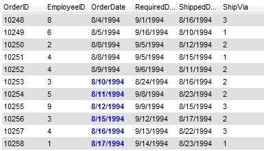
Let's say that you are using the BackColorAlternate property to alternate the colors for rows in the list, so the list with no selection shows as follows:

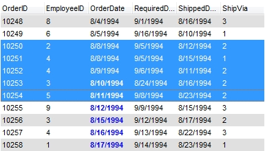
By default, the SelBackMode property is exOpaque, so the selected items looks like follows:

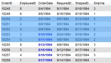
And if the SelBackMode property is set on exTransparent, the selected rows do not change their background/foreground colors as shown bellow:

The following screen shot shows the control when no items are selected:

The following screen shot shows the first three items selected, while the SelBackMode property is exOpaque:

The following screen shot shows the first three items selected, while the SelBackMode property is exOpaque, and FullRowSelect property is 0:

The following screen shot shows the first three items selected, while the SelBackMode property is exTransparent:

The following screen shot shows the first three items selected, while the SelBackMode property is exGrid:


