

 A standard text edit field.
The editor supports the following options:
- exEditRight, Right-aligns text in a single-line or multiline edit control.
- exEditPassword, Specifies a value that indicates whether an edit control displays all characters as an asterisk (*) as they are typed ( passwords ).
- exEditPasswordChar, Specifies a value that indicates the password character.
- exEditLimitText, Limits the length of the text that the user may enter into an edit control.
- exEditDecimalSymbol, Specifies the symbol that indicates the decimal values while editing a floating point number. The Numeric property should be on exFloat.
- exEditSelStart, Sets the starting point of text selected, when an EditType editor is opened.
- exEditSelLength, Sets the number of characters selected, when an EditType editor is opened.
- exEditLockedBackColor property. Specifies the background color for a locked edit control.
- exEditLockedForeColor property. Specifies the foreground color for a locked edit control.
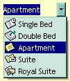 It provides an intuitive interface for your users to select values from
pre-defined lists presented in a drop-down window, but it accepts new values at
runtime too. The DropDownType editor has associated a standard text edit field
too. Use AddItem or InsertItem
method to add predefined
values to the drop down list. The DropDownRows
property specifies the maximum number of visible rows into the drop-down list.
The editor displays the CellValue
value, not the identifier of the selected item. The EditType options are
supported too.
It provides an intuitive interface for your users to select values from
pre-defined lists presented in a drop-down window, but it accepts new values at
runtime too. The DropDownType editor has associated a standard text edit field
too. Use AddItem or InsertItem
method to add predefined
values to the drop down list. The DropDownRows
property specifies the maximum number of visible rows into the drop-down list.
The editor displays the CellValue
value, not the identifier of the selected item. The EditType options are
supported too.
The following sample adds a column with a DropDownType editor:
With .Columns.Add("Editor").Editor
    .EditType = DropDownType
    .AddItem 0, "Single Bed", 1
    .AddItem 1, "Double Bed", 2
    .AddItem 2, "Apartment", 3
    .AddItem 3, "Suite", 4
    .AddItem 4, "Royal Suite", 5
End With
.Items.CellValue(.Items(0), "Editor") = "Apartment"
The editor supports the following options:
- exDropDownBackColor, specifies the drop down's background color
- exDropDownForeColor, specifies the drop down's foreground color
- exDropDownColumnCaption, specifies the HTML caption for each column within the drop down list, separated by ¦ character (vertical broken bar, ALT + 221)
- exDropDownColumnWidth, specifies the width for each column within the drop down list, separated by ¦ character (vertical broken bar, ALT + 221).
- exDropDownColumnPosition, specifies the position for each column within the drop down list, separated by ¦ character (vertical broken bar, ALT + 221).
- exDropDownColumnAutoResize, specifies whether the drop down list resizes automatically its visible columns to fit the drop down width
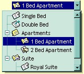 It provides an intuitive interface for your users to select values from
predefined lists presented in a drop-down window. The DropDownListType editor has
no standard edit field associated. Use the AddItem
or InsertItem method to add predefined values to the drop down list.
The DropDownRows
property specifies the maximum number of visible rows into the drop-down list. The
editor displays
the caption of the item that matches the CellValue
value. The item's icon is also displayed if it exists.
It provides an intuitive interface for your users to select values from
predefined lists presented in a drop-down window. The DropDownListType editor has
no standard edit field associated. Use the AddItem
or InsertItem method to add predefined values to the drop down list.
The DropDownRows
property specifies the maximum number of visible rows into the drop-down list. The
editor displays
the caption of the item that matches the CellValue
value. The item's icon is also displayed if it exists.
The following sample adds a column with a DropDownListType editor:
With .Columns.Add("Editor").Editor
    .DropDownAutoWidth = False
    .EditType = DropDownListType
    .AddItem 0, "Single Bed", 1
    .AddItem 1, "Double Bed", 2
    .AddItem 2, "Apartments", 3
    .InsertItem 3, "1 Bed Apartment", 4, 2
    .InsertItem 4, "2 Bed Apartment", 5, 2
    .AddItem 5, "Suite", 4
    .InsertItem 6, "Royal Suite", 1, 5
    .InsertItem 7, "Deluxe Suite", 2, 5
    .ExpandAll
End With
.Items.CellValue(.Items(0), "Editor") = 3
The editor supports the following options:
- exDropDownImage, displays the predefined icon in the control's cell, if the user selects an item from a drop down editor.
- exDropDownBackColor, specifies the drop down's background color
- exDropDownForeColor, specifies the drop down's foreground color
- exDropDownColumnCaption, specifies the HTML caption for each column within the drop down list, separated by ¦ character (vertical broken bar, ALT + 221)
- exDropDownColumnWidth, specifies the width for each column within the drop down list, separated by ¦ character (vertical broken bar, ALT + 221).
- exDropDownColumnPosition, specifies the position for each column within the drop down list, separated by ¦ character (vertical broken bar, ALT + 221).
- exDropDownColumnAutoResize, specifies whether the drop down list resizes automatically its visible columns to fit the drop down width
 The SpinType allows your users to view and change numeric values using a
familiar up/down button (spin control) combination. The AddItem
or InsertItem
method has no effect, if the EditType is SpinType. Use the exSpinStep option to
specify the proposed change when user clicks the spin. Use the Numeric
property to specify whether the edit control allows only numeric values
only. Use the
exSpinUpButtonUp,
exSpinUpButtonDown, exSpinDownButtonUp and
exSpinDownButtonDown to change the visual appearance for the spin control.
The SpinType allows your users to view and change numeric values using a
familiar up/down button (spin control) combination. The AddItem
or InsertItem
method has no effect, if the EditType is SpinType. Use the exSpinStep option to
specify the proposed change when user clicks the spin. Use the Numeric
property to specify whether the edit control allows only numeric values
only. Use the
exSpinUpButtonUp,
exSpinUpButtonDown, exSpinDownButtonUp and
exSpinDownButtonDown to change the visual appearance for the spin control.
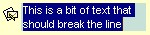 The MemoType is designed to provide an unique and intuitive interface, which you
can implement within your application to assist users in working with textual
information. If all information does not fit within the edit box, the window of
the editor is enlarged. The AddItem
or InsertItem
method has no effect, if the EditType is MemoType. You can use options
like exMemoHScrollBar, exMemoVScrollBar and so on.
The MemoType is designed to provide an unique and intuitive interface, which you
can implement within your application to assist users in working with textual
information. If all information does not fit within the edit box, the window of
the editor is enlarged. The AddItem
or InsertItem
method has no effect, if the EditType is MemoType. You can use options
like exMemoHScrollBar, exMemoVScrollBar and so on.
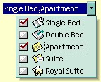 It provides an intuitive interface for your users to check values from
predefined lists presented in a drop-down window. Each item has a check box
associated. The editor displays the list of item captions, separated by comma,
that is OR combination of CellValue value. Use
the The AddItem
or InsertItem
method to add new predefined values to the drop down list. The
DropDownRows property specifies the
maximum number of visible rows into the drop-down list. Use the CheckImage
property to change the check box appearance.
It provides an intuitive interface for your users to check values from
predefined lists presented in a drop-down window. Each item has a check box
associated. The editor displays the list of item captions, separated by comma,
that is OR combination of CellValue value. Use
the The AddItem
or InsertItem
method to add new predefined values to the drop down list. The
DropDownRows property specifies the
maximum number of visible rows into the drop-down list. Use the CheckImage
property to change the check box appearance.
The following sample adds a column with a CheckListType editor:
With .Columns.Add("Editor").Editor
    .EditType = CheckListType
    .AddItem 1, "Single Bed", 1
    .AddItem 2, "Double Bed", 2
    .AddItem 4, "Apartment", 3
    .AddItem 8, "Suite", 4
    .AddItem 16, "Royal Suite", 5
End With
.Items.CellValue(.Items(0), "Editor") = 5
The editor supports the following options:
- exDropDownBackColor, specifies the drop down's background color
- exDropDownForeColor, specifies the drop down's foreground color
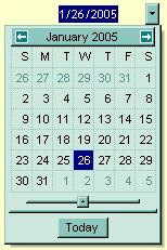 The DateType is a date/calendar control (not the Microsoft Calendar Control). The dropdown
calendar provides an efficient and appealing way to edit dates at runtime. The
DateType editor has a standard edit control associated. The user can easy select
a date by selecting a date from the drop down calendar, or by typing directly
the date. The editor displays the CellValue
value as date. To change how the way how the control displays the date you can
use FormatColumn event. The AddItem
or InsertItem
method has no effect, if the EditType is DateType.
The DateType is a date/calendar control (not the Microsoft Calendar Control). The dropdown
calendar provides an efficient and appealing way to edit dates at runtime. The
DateType editor has a standard edit control associated. The user can easy select
a date by selecting a date from the drop down calendar, or by typing directly
the date. The editor displays the CellValue
value as date. To change how the way how the control displays the date you can
use FormatColumn event. The AddItem
or InsertItem
method has no effect, if the EditType is DateType.
The following sample adds a column with a DateType editor:
With .Columns.Add("Editor").Editor
    .EditType = DateType
End With
.Items.CellValue(.Items(0), "Editor") = Date
 You can use the MaskType to enter any data that includes
literals and requires a mask to filter characters during data input. You can use
this control to control the entry of many types of formatted information such as
telephone numbers, social security numbers, IP addresses, license keys etc. The Mask
property specifies the editor's mask. The MaskChar
property specifies the masking character. The AddItem
or InsertItem
method has no effect, if the EditType is MaskType. The Mask property can use
one or more literals: #,x,X,A,?<,>,*,\,{nMin,nMax},[...].
You can use the MaskType to enter any data that includes
literals and requires a mask to filter characters during data input. You can use
this control to control the entry of many types of formatted information such as
telephone numbers, social security numbers, IP addresses, license keys etc. The Mask
property specifies the editor's mask. The MaskChar
property specifies the masking character. The AddItem
or InsertItem
method has no effect, if the EditType is MaskType. The Mask property can use
one or more literals: #,x,X,A,?<,>,*,\,{nMin,nMax},[...].
The following sample shows how to mask a column for input phone numbers:
With .Columns.Add("Editor").Editor
    .EditType = MaskType
    .Mask = "(###) ### - ####"
End With
.Items.CellValue(.Items(0), "Editor") = "(214) 345 - 789"
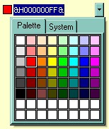 You can include a color selection control in your applications via the ColorType
editor. Check the ColorListType also. The editor has a standard edit control and a color drop-down window. The
color drop-down window contains two tabs that can be used to select colors, the
"Pallette" tab shows a grid of colors, while the "System"
tab shows the current windows color constants. The AddItem
or InsertItem
methodhas no effect, if the EditType is ColorType. You can use options
like exColorShowPalette or exColorShowSystem.
You can include a color selection control in your applications via the ColorType
editor. Check the ColorListType also. The editor has a standard edit control and a color drop-down window. The
color drop-down window contains two tabs that can be used to select colors, the
"Pallette" tab shows a grid of colors, while the "System"
tab shows the current windows color constants. The AddItem
or InsertItem
methodhas no effect, if the EditType is ColorType. You can use options
like exColorShowPalette or exColorShowSystem.
The following sample adds a column with a ColorType editor:
With .Columns.Add("Editor").Editor
    .EditType = ColorType
End With
.Items.CellValue(.Items(0), "Editor") = vbRed
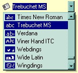 Provides an intuitive way for selecting fonts. The FontType editor contains a
standard edit control and a font drop-down window. The font drop-down window
contains a list with all system fonts. The AddItem
or InsertItem
method has no effect, if the EditType is FontType. The DropDownRows
property specifies the maximum number of visible rows into the drop=down list.
Provides an intuitive way for selecting fonts. The FontType editor contains a
standard edit control and a font drop-down window. The font drop-down window
contains a list with all system fonts. The AddItem
or InsertItem
method has no effect, if the EditType is FontType. The DropDownRows
property specifies the maximum number of visible rows into the drop=down list.
The following sample adds a column with a FontType editor:
With .Columns.Add("Editor").Editor
    .EditType = FontType
End With
.Items.CellValue(.Items(0), "Editor") = "Times New Roman"
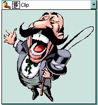 The PictureType provides an elegant way for displaying the fields of OLE Object
type and cells that have a reference to an IPicture interface. An OLE Object
field can contain a picture, a Microsoft Clip Gallery, a package, a chart,
PowerPoint slide, a word document, a WordPad document, a wave file, an so on. In
MS Access you can specify the field type to OLE Object. The DropDownMinWidth
property specifies the minimum width for the drop=down window. The drop-down
window is scaled based on the picture size. The AddItem
or InsertItem
method has no effect, if the EditType is PictureType. If your control is
bounded to a ADO recordset, it automatically detects the OLE Object fields, so
setting the editor's type to PictureType is not necessary. If your control
is not bounded to an ADO recordset you can use the following sample to view OLE
objects in the column "OLEObject" ( the sample uses the NWIND database
installed in your VB folder.
The PictureType provides an elegant way for displaying the fields of OLE Object
type and cells that have a reference to an IPicture interface. An OLE Object
field can contain a picture, a Microsoft Clip Gallery, a package, a chart,
PowerPoint slide, a word document, a WordPad document, a wave file, an so on. In
MS Access you can specify the field type to OLE Object. The DropDownMinWidth
property specifies the minimum width for the drop=down window. The drop-down
window is scaled based on the picture size. The AddItem
or InsertItem
method has no effect, if the EditType is PictureType. If your control is
bounded to a ADO recordset, it automatically detects the OLE Object fields, so
setting the editor's type to PictureType is not necessary. If your control
is not bounded to an ADO recordset you can use the following sample to view OLE
objects in the column "OLEObject" ( the sample uses the NWIND database
installed in your VB folder.
Change the path if necessary, in the following sample:
' Creates an ADO Recordset
Dim rs As Object
Set rs = CreateObject("ADODB.Recordset")
rs.Open "Employees", "Provider=Microsoft.Jet.OLEDB.4.0;Data Source= D:\Program Files\Microsoft Visual Studio\VB98\NWIND.MDB", 3

' Adds a column of PictureType edit
Dim c As Column
Set c = .Columns.Add("OLEObject")
With c.Editor
.EditType = PictureType
End With
.Items.CellValue(.Items(0), "OLEObject") = rs("Photo").Value
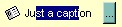 The ButtonType editor consists into a standard edit field and a "..."
button. The ButtonClick event is
fired if the user has clicked the button. The AddItem
or InsertItem method has no effect, if the EditType is ButtonType. Of course, you can apply
for multiple buttons using the AddButton
method, for any types.
The ButtonType editor consists into a standard edit field and a "..."
button. The ButtonClick event is
fired if the user has clicked the button. The AddItem
or InsertItem method has no effect, if the EditType is ButtonType. Of course, you can apply
for multiple buttons using the AddButton
method, for any types.
 Uses the CellValue
property to
specify the percent being displayed in the ProgressBarTpe editor. The CellValue property should be
between 0 and 100.
Uses the CellValue
property to
specify the percent being displayed in the ProgressBarTpe editor. The CellValue property should be
between 0 and 100.
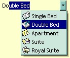 It provides an intuitive interface for your users to select values from
pre-defined lists presented in a drop-down window. The PickEditType editor has a
standard edit field associated, that useful for searching items while typing. The DropDownRows
property specifies the maximum number of visible rows into the drop=down list. Use AddItem
or InsertItem method to add new predefined values to the drop down list. The
editor displays
the caption of the item that matches the CellValue
value. The item's icon is also displayed if it exists.
It provides an intuitive interface for your users to select values from
pre-defined lists presented in a drop-down window. The PickEditType editor has a
standard edit field associated, that useful for searching items while typing. The DropDownRows
property specifies the maximum number of visible rows into the drop=down list. Use AddItem
or InsertItem method to add new predefined values to the drop down list. The
editor displays
the caption of the item that matches the CellValue
value. The item's icon is also displayed if it exists.
The following sample shows how to add values to a drop down list:
With .Columns.Add("Editor").Editor
    .EditType = PickEditType
    .AddItem 0, "Single Bed", 1
    .AddItem 1, "Double Bed", 2
    .AddItem 2, "Apartment", 3
    .AddItem 3, "Suite", 4
    .AddItem 4, "Royal Suite", 5
End With
.Items.CellValue(.Items(0), "Editor") = "Apartment"
The editor supports the following options:
- exDropDownBackColor, specifies the drop down's background color
- exDropDownForeColor, specifies the drop down's foreground color
- exDropDownColumnCaption, specifies the HTML caption for each column within the drop down list, separated by ¦ character (vertical broken bar, ALT + 221)
- exDropDownColumnWidth, specifies the width for each column within the drop down list, separated by ¦ character (vertical broken bar, ALT + 221).
- exDropDownColumnPosition, specifies the position for each column within the drop down list, separated by ¦ character (vertical broken bar, ALT + 221).
- exDropDownColumnAutoResize, specifies whether the drop down list resizes automatically its visible columns to fit the drop down width
 The LinkEditType control allows your application to edit and display hyperlink
addresses.
The LinkEditType control allows your application to edit and display hyperlink
addresses.
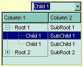 The control is able to use ActiveX controls as a built-in editor. The control
uses the UserEditor property to define the
user control. If it succeeded the UserEditorObject
property retrieves the newly created object. Events like: UserEditOpen,
UserEditClose and UserEditorOleEvent
are fired when the control uses custom editors. The setup installs the VB\UserEdit,
VC\User.Edit samples that uses Exontrol's
ExComboBox component as a new editor into the ExG2antt component ( a multiple
columns combobox control ).
The control is able to use ActiveX controls as a built-in editor. The control
uses the UserEditor property to define the
user control. If it succeeded the UserEditorObject
property retrieves the newly created object. Events like: UserEditOpen,
UserEditClose and UserEditorOleEvent
are fired when the control uses custom editors. The setup installs the VB\UserEdit,
VC\User.Edit samples that uses Exontrol's
ExComboBox component as a new editor into the ExG2antt component ( a multiple
columns combobox control ).
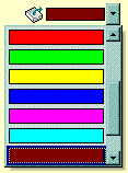
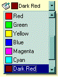 You can include a color selection control in your application via the
ColorListType editor, also. The editor hosts a predefined list of colors. By
default. the following colors are added: Black, White, Dark Red, Dark Green, Dark Yellow, Dark Blue, Dark Magenta, Dark Cyan, Light Grey, Dark Grey, Red, Green, Yellow, Blue, Magenta, Cyan.
The AddItem
method adds a new color to your color list editor. You can use the exColorListShowName
option to display the color's name.
You can include a color selection control in your application via the
ColorListType editor, also. The editor hosts a predefined list of colors. By
default. the following colors are added: Black, White, Dark Red, Dark Green, Dark Yellow, Dark Blue, Dark Magenta, Dark Cyan, Light Grey, Dark Grey, Red, Green, Yellow, Blue, Magenta, Cyan.
The AddItem
method adds a new color to your color list editor. You can use the exColorListShowName
option to display the color's name.
The following sample adds few custom colors to the ColorListType editor:
With .Columns.Add("Editor").Editor
    .EditType = ColorListType
    .AddItem 128, "Dark Red"
    .AddItem RGB(0, 128, 0), "Dark Green"
    .AddItem RGB(0, 0, 128), "Dark Blue"
End With
.Items.CellValue(.Items(0), "Editor") = 128
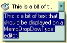 It provides a multiple lines edit control that's displayed into a drop down
window.
It provides a multiple lines edit control that's displayed into a drop down
window.
- The Editor.Option( exMemoDropDownWidth ) specifies the width ( in pixels ) of the MemoDropDownType editor when it is dropped.
- The Editor.Option( exMemoDropDownHeight ) specifies the height ( in pixels ) of the MemoDropDownType editor when it is dropped.
- The Editor.Option( exMemoDropDownAcceptReturn ) specifies whether the user closes the MemoDropDownType editor by pressing the ENTER key. If the Editor.Option( exMemoDropDownAcceptReturn ) is True, the user inserts new lines by pressing the ENTER key. The user can close the editor by pressing the CTRL + ENTER key. If the Editor.Option( exMemoDropDownAcceptReturn ) is False, the user inserts new lines by pressing the CTRL + ENTER key. The user can close the editor by pressing the ENTER key.
- The Editor.Option( exMemoHScrollBar ) adds the horizontal scroll bar to a MemoType or MemoDropDownType editor.
- The Editor.Option( exMemoVScrollBar ) adds the vertical scroll bar to a MemoType or MemoDropDownType editor
- Use the Items.CellSingleLine property to specify whether the cell displays multiple lines
The AddItem or InsertItem method has no effect, if the EditType is MemoDropDownType.
- exCheckValue0. Specifies the check box state being displayed for unchecked state
- exCheckValue1. Specifies the check box state being displayed for checked state
- exCheckValue2. Specifies the check box state being displayed for partial-check state
For instance, if your cells load boolean values ( True is -1, False is 0 ), the control displays the partial-check icon for True values. You can call the following code before loading the CheckValueType editor:
G2antt1.DefaultEditorOption(exCheckValue2) = 1
in order to replace the partial-check appearance, to check state appearance.
 Adds a
slider control to a cell. Use the exSliderWidth,
exSliderStep, exSliderMin, exSliderMax options to control the slider
properties. Use the exSpinStep option to hide
the spin control. Use the
exSpinUpButtonUp,
exSpinUpButtonDown, exSpinDownButtonUp and
exSpinDownButtonDown to change the visual appearance for the spin control. Use
the
exSliderRange and
exSliderThumb to change the visual appearance for the slider control.
Adds a
slider control to a cell. Use the exSliderWidth,
exSliderStep, exSliderMin, exSliderMax options to control the slider
properties. Use the exSpinStep option to hide
the spin control. Use the
exSpinUpButtonUp,
exSpinUpButtonDown, exSpinDownButtonUp and
exSpinDownButtonDown to change the visual appearance for the spin control. Use
the
exSliderRange and
exSliderThumb to change the visual appearance for the slider control.
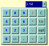 Adds a drop down calculator to a
node. Use the exCalcExecuteKeys,
exCalcCannotDivideByZero, exCalcButtonWidth, exCalcButtonHeight, exCalcButtons,
exCalcPictureUp, exCalcPictureDown to
specify different options for calculator editor.
Adds a drop down calculator to a
node. Use the exCalcExecuteKeys,
exCalcCannotDivideByZero, exCalcButtonWidth, exCalcButtonHeight, exCalcButtons,
exCalcPictureUp, exCalcPictureDown to
specify different options for calculator editor.